Is your site creating user experience problems?
I’ve run across some great posts recently discussing usability issues around modern website design trends. There are two issues that are particularly worth paying attention to because each could potentially erode the user experience on your site.
First, a word about “above the fold"
Central to both of these two trends is the concept of “above the fold”. That’s actually an old newspaper term that was used to describe the big picture and story that would appear on the top half of the newspaper when it was folded. It was the most important news, presented in a way that made you want to dig deeper into the paper. For websites, it’s the area that appears on your screen before you scroll.
Now, on to those two design trends.
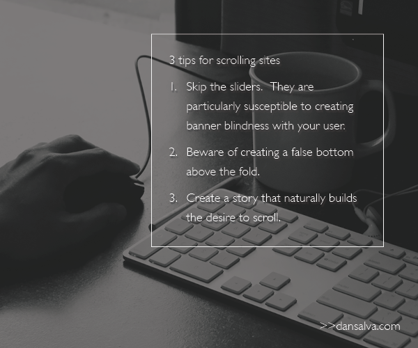
1. The slider
Today, many sites feature a slider that takes up the entire area above the fold. The visual and message changes out at regular intervals, allowing the company to prominently display multiple messages.
I understand why sliders are popular - especially with big, multi-division organizations. It’s not unusual for divisions within these organizations to vie for space on the home page. A slider allows marketing to appease divisional leaders by including their messages in the most prominent space on the site. That can mean a slider with three, five, and even seven different slides.
I’m not a fan of sliders. It’s too easy to use them rather than do the hard work of prioritizing and focusing your story.
Additionally, there are studies that demonstrate that users have developed “banner blindness”. In other words, they recognize the promotional nature of banners and have a tendency to ignore them. You may think that the motion of a slider may be enough to grab their attention. But the opposite is true. Users have come to associate motion on a website with promotion, and now have a tendency to ignore areas changing out in the slider.
On top of all this, sliders rarely have the impact when they are reduced to the mobile screen. Images and text become small. And users won’t wait to watch your slides cycle through.
2. The scroll
Many modern websites feature a prominent image and require the user to scroll to reveal the rest of the story.
I am a big fan. But only when done right. What does that mean?
- The company has done an excellent job of distilling their most compelling communication down to one striking visual and words that make you want to know more.
- The story effortlessly carries you down as you scroll. In fact, you don’t even notice that you’re scrolling.
The things to be wary of:
- Fooling yourself into believing you’ve created something compelling - it’s easy to get caught up in the eye candy. You use a big colorful image. You add a simple description of your company/product. It seems visually striking and bold in its brevity. But, in reality, you haven’t given your user a reason to care. Let’s face it, we’re all pretty selfish. We want to know what’s in it for us. If you’re just talking about you, we just don’t care that much.
- Creating a false bottom - this happens when the visual fills the entire screen and gives you the false impression that there is nothing to scroll down to. You can give users a visual cue, like a downward pointing arrow. But that’s just putting a bandaid on a execution that hasn’t naturally given the user the desire to dig (scroll) deeper to learn more.
- The mobile environment is a little more forgiving when it comes to scrolling. Here, users have come to expect to scroll because of the limited screen size.
For more about the fold and scrolling, check out this excellent post from the Nielsen Norman Group.
Think of it as them “paying” attention
Users have a limited amount of attention. And they are making decisions to pay out that attention to a select few. I love that the Nielsen Norman Group characterized “scrolling” as an interaction cost. When I think of it as a cost, it makes me want to create something worth their time and effort.
It comes down to storytelling
Here’s the secret to creating a great site with an excellent user experience (that your users are willing to pay attention to). Create a great story first. Lead with a focused, compelling thought. And then roll out the tale in a way that has your users willingly joining you for the journey.
Great stories give people a reason to engage. Create a great story, and the issues of sliders and scrolling will take care of themselves.
—
Sign up for my email updates and get the latest insights in your inbox.