3 tips for communicating visually
There is real evidence that visual communication can significantly improve your audience’s retention of your information when compared to using words alone.
It used to take specialized tools to create those visualizations. But, new online tools now make it easier than ever for anyone to create compelling visuals – whether it is charting your data or building an infographic.
Of course, these tools can’t magically give you expert design skills. But if you follow a few guidelines, you may surprise yourself with the visualizations you can create. Here are 3 tips to help you do that.
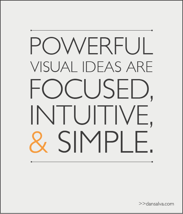
Focus
When visuals get complex and confusing, it’s usually a result of trying to do too much with your execution. Choose one idea to visualize and remove the extraneous.
Make it intuitive
What is the first thing that you want your audience to view? What’s the second? What’s the third? Use things like size, color, and contrast to create your hierarchy of elements. If two elements have the same emphasis, consider how you can adjust to give the more important element more dominance.
Keep it simple
It can be argued that a good design is not determined by what you add, but rather what you remove from the design. The lesson here is that keeping things simple can improve the power of your visual. This very well may be the most important tip to remember.
Too often, companies settle for a generic image with their communication. Yes, it can add visual appeal, but it doesn't have near the power of illustrating the point you are making. Try the tools. Use these tips. And don't be afraid of a little trial and error. The results are worth the effort.